¶ Adding variety
One of the main advantages of Blazor/HTML/CSS is incredible flexibility—almost any idea can be implemented and usually it's not too hard, especially compared to many other UI frameworks.
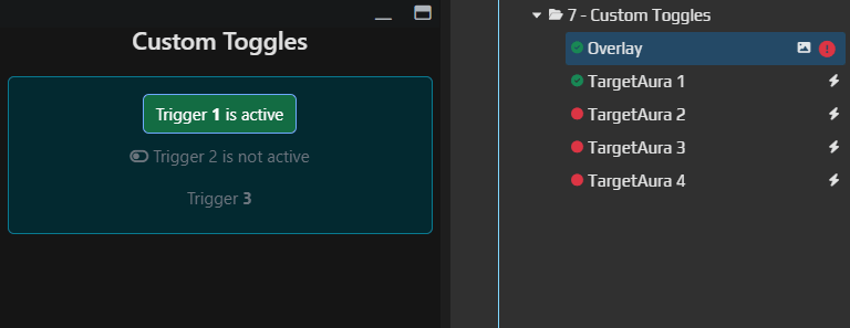
Let's customize our group of toggles and add some color.
¶ UserOverlay.cs
public partial class UserOverlay : BlazorReactiveComponent {

    [Inject]
    public IAuraTreeScriptingApi AuraTree { get; init; }

    public bool Trigger1IsActive
    {
        get => AuraTree.GetTriggerByPath<IHotkeyIsActiveTrigger>("./TargetAura 1").TriggerValue ?? false;
        set => AuraTree.GetTriggerByPath<IHotkeyIsActiveTrigger>("./TargetAura 1").TriggerValue = value;
    }

    public bool Trigger2IsActive
    {
        get => AuraTree.GetTriggerByPath<IHotkeyIsActiveTrigger>("./TargetAura 2").TriggerValue ?? false;
        set => AuraTree.GetTriggerByPath<IHotkeyIsActiveTrigger>("./TargetAura 2").TriggerValue = value;
    }

    public bool Trigger3IsActive
    {
        get => AuraTree.GetTriggerByPath<IHotkeyIsActiveTrigger>("./TargetAura 3").TriggerValue ?? false;
        set => AuraTree.GetTriggerByPath<IHotkeyIsActiveTrigger>("./TargetAura 3").TriggerValue = value;
    }

    public bool Trigger4IsActive
    {
        get => AuraTree.GetTriggerByPath<IHotkeyIsActiveTrigger>("./TargetAura 4").TriggerValue ?? false;
        set => AuraTree.GetTriggerByPath<IHotkeyIsActiveTrigger>("./TargetAura 4").TriggerValue = value;
    }

    protected override void OnInitialized()
    {
        ChangeTrackers.Add(Observable.Timer(DateTimeOffset.Now, TimeSpan.FromSeconds(1)));
        base.OnInitialized();
    }
}
¶ UserOverlay.razor
@using PoeShared.Blazor.Controls
@inherits BlazorReactiveComponent

<h3 class="text-center shadow-1">Custom Toggles</h3>

<div class="text-center mt-4 mx-2 d-flex gap-1 flex-column alert alert-info">
    @if (Trigger1IsActive){
         <ToggleButton @bind-IsChecked="@Trigger1IsActive"
            Class="btn btn-success">
            Trigger <b>1</b> is active
        </ToggleButton>
    } else {
         <ToggleButton @bind-IsChecked="@Trigger1IsActive"
            Class="btn btn-outline-danger">
            Trigger <b>1</b> is inactive
        </ToggleButton>
    }
    <ToggleButton @bind-IsChecked="@Trigger2IsActive">
        @if (Trigger2IsActive){
            <i class="fa-solid fa-toggle-on"></i>
            <strong>Trigger 2 is active</strong>
        } else {
            <i class="fa-solid fa-toggle-off"></i>
            <span>Trigger 2 is not active</span>
        }
    </ToggleButton>
    <span class="d-flex gap-1 align-self-center">

        <ToggleButton @bind-IsChecked="@Trigger3IsActive">
            Trigger <b>3</b>
        </ToggleButton>
        @if (Trigger3IsActive){
            <span class="vr"></span>

            <ToggleButton @bind-IsChecked="@Trigger4IsActive">
                Trigger <b>4</b>
            </ToggleButton>
        }
    </span>
</div>
¶ Breakdown
¶ UserOverlay.cs
Nothing special—just several properties accessing triggers.
¶ UserOverlay.razor
This file contains several customization approaches. In real projects try not to mix too many techniques—such code is harder to maintain!
<div class="text-center mt-4 mx-2 d-flex gap-1 flex-column alert alert-info">
The class list changed:
flex-column– combined withd-flexit renders elements stacked vertically instead of in a row
@if (Trigger1IsActive){
         <ToggleButton @bind-IsChecked="@Trigger1IsActive"
            Class="btn btn-success">
            Trigger <b>1</b> is active
        </ToggleButton>
    } else {
         <ToggleButton @bind-IsChecked="@Trigger1IsActive"
            Class="btn btn-outline-danger">
            Trigger <b>1</b> is inactive
        </ToggleButton>
    }
First variant: on each render we choose the button style beforehand and render a completely new component. We don't change properties of the same component—we create a new one. Use this when too many properties change; otherwise it's a bit "dirty".
<ToggleButton @bind-IsChecked="@Trigger2IsActive">
        @if (Trigger2IsActive){
            <i class="fa-solid fa-toggle-on"></i>
            <strong>Trigger 2 is active</strong>
        } else {
            <i class="fa-solid fa-toggle-off"></i>
            <span>Trigger 2 is not active</span>
        }
</ToggleButton>
Second variant—the most common. Typically you'll update the content of a component rather than the component itself.
 <span class="d-flex gap-1 align-self-center">
        <ToggleButton @bind-IsChecked="@Trigger3IsActive">
            Trigger <b>3</b>
        </ToggleButton>
        @if (Trigger3IsActive){
            <span class="vr"></span>

            <ToggleButton @bind-IsChecked="@Trigger4IsActive">
                Trigger <b>4</b>
            </ToggleButton>
        }
    </span>
Here we use conditions to render an additional button dynamically. It appears only when Trigger 3 is active. You could build a whole hierarchy of settings like this. But remember that a "jumping" interface is bad UX—avoid it when possible.