¶ CSS and what it is
CSS (Cascading Style Sheets) describes the styles of your interface: colors, sizes, and so on.
The mechanism is extremely powerful and over the years has gained so many details that a full description would fill a thick book. Fortunately it's also simple—easy to learn, hard to master—and you don't need to understand its internals to use it effectively.
¶ Bootstrap
Bootstrap is a massive collection of useful CSS classes covering most common requests—colored buttons, editors, etc. EyeAuras loads Bootstrap CSS/JS automatically, so all classes from the documentation are available in any overlay by default. We've already been using them throughout the series.
Sometimes standard styles aren't enough and you want something custom. Let's take the code that toggles a trigger and simply recolor the button using CSS.
¶ UserOverlay.cs
public partial class UserOverlay : BlazorReactiveComponent {

    [Inject]
    public IAuraTreeScriptingApi AuraTree { get; init; }

    public bool TriggerIsActive
    {
        get => AuraTree.GetTriggerByPath<IHotkeyIsActiveTrigger>("./TargetAura").TriggerValue ?? false;
        set => AuraTree.GetTriggerByPath<IHotkeyIsActiveTrigger>("./TargetAura").TriggerValue = value;
    }

    protected override void OnInitialized()
    {
        ChangeTrackers.Add(Observable.Timer(DateTimeOffset.Now, TimeSpan.FromSeconds(1)));
        base.OnInitialized();
    }
}
¶ UserOverlay.razor
@using PoeShared.Blazor.Controls
@inherits BlazorReactiveComponent
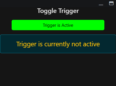
<style>
.custom-button {
background: lime;
color: black;
width: 80%;
}
</style>
<h3 class="text-center shadow-1">Toggle Trigger</h3>
<div class="text-center mt-4">
<ToggleButton
@bind-IsChecked="@TriggerIsActive"
Class="btn custom-button">
Trigger is Active
</ToggleButton>
</div>
<p class="text-center mt-3 alert alert-info" style="font-size: 1.5rem;">
@if (TriggerIsActive){
<span class="shadow-1">Trigger is currently active</span>
} else {
<span class="text-warning shadow-1">Trigger is currently not active</span>
}
</p>
¶ Breakdown
¶ UserOverlay.razor
<style>
.custom-button {
    background: lime;
    color: black;
    width: 80%;
}
</style>
This is an inline style—define a CSS class directly in the component and use it right away. It's simple and fine for small projects, but has downsides. It's better to switch to proper CSS files as your project grows; that's the standard approach in web development.
¶ Additional
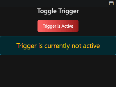
ChatGPT and other bots handle CSS well and can generate all kinds of classes. For example, here's CSS from ChatGPT 4o that adds a gradient. We're not discussing optimality—leave that to the pros 
.custom-button {
    background: linear-gradient(90deg, red, darkred);
    color: white;
    border: none;
    padding: 0.6rem 1.2rem;
    font-size: 1rem;
    border-radius: 0.3rem;
    cursor: pointer;
    position: relative;
    overflow: hidden;
    transition: background 0.3s ease;
}

.custom-button::before {
    content: '';
    position: absolute;
    top: 0; left: -100%;
    width: 200%;
    height: 100%;
    background: linear-gradient(90deg, rgba(255,255,255,0.1), rgba(255,255,255,0.4), rgba(255,255,255,0.1));
    transition: left 0.6s ease-in-out;
    z-index: 1;
}

.custom-button:hover::before {
    left: 100%;
}

.custom-button > * {
    position: relative;
    z-index: 2;
}